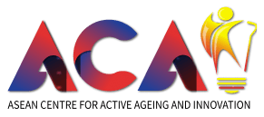
DESCRIPTION OF THE LOGO:
1. The logo consists of the letters A, C, A, and I, which indicate the abbreviation for 'ASEAN Centre for Active Ageing and Innovation'.
2. The letter I is formed by the shape of a light bulb, which represents innovation.
3. At the heart of the lightbulb graphic is the figure of a spirited elderly person, cane in hand, symbolising both wisdom and vitality.
4. Red represents energy, love, and positivity. We have to encourage the older people to be active with positive energy and care for them with love.
5. Blue represents unity, peace, and harmony. Although we are from different backgrounds, we can be united and live together in peace and harmony. Together, we care for the older people.
6. Yellow represents active, innovative, and creative ideas. The young generation can help the elderly with their innovation and creative ideas.
7. The gradients of the colours represent the ASEAN countries that have multi-cultural people.